This tutorial will take you through the main steps of building a responsive dashboard using Vue.js.
First by using basic HTML, then ramping it up with SVG, and finally we’ll take a look at using Canvas.
Download the complete source code from github.
Project Setup
One main paradygm of vue.js is the single file component, this means each component contains its own html markup, javascript scripts and CSS styles inside a single .vue file.
In order to bundle such app architecture into production-ready static assets, the most common way is to use a Webpack custom Vue loader, which can be a bit confusing when getting started. Luckily Vue offers a very useful command line interface to boostrap a project in no time.
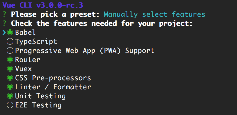
• Install Vue cli globally
npm install -g @vue/cli
• Create a new project (from parent directory)
vue create my-cool-dashboard
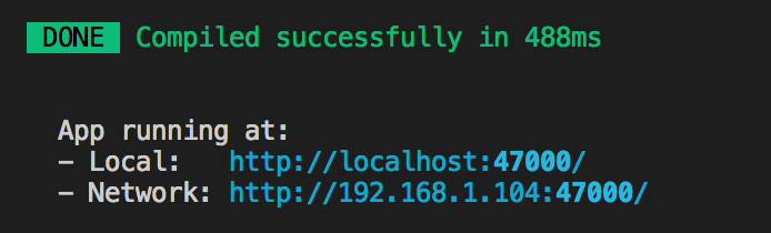
The script should run for a little while, installing the npm dependencies. Once complete, navigate inside the newly created directory and let’s start the webpack dev server
cd ./my-cool-dashboard/
npm run serve
Now your dev server should be running, if you navigate to the server url, you should see the demo Vue.js landing page.
We’re ready to cook!
When initializing the project, make sure to select Babel, Vuex and SCSS in order to be able to run the following code samples. Use space bar to toggle options and up/down arrows to navigate.
Responsive Grid
Our dashboard is going to display multiple charts on different platforms and screen sizes. Our goal is to setup a responsive system to optimize the surface available and display the charts in a responsive way. There is a great article that covers the technique using Less. The code below is very similar to the exception it uses SASS instead, also the grid is 6 columns instead of 12. Below is the key SCSS mixins:
@mixin flex-size($col: 6, $gutter: 1%) {
  flex-basis: (100% / (6 / $col)) - $gutter * 2;
}

@mixin six-columns-layout($screen-type: desktop, $gutter: 1%) {
  .#{$screen-type}-1-col {
    @include flex-size(1, $gutter);
  }
  .#{$screen-type}-2-col {
    @include flex-size(2, $gutter);
  }
  .#{$screen-type}-3-col {
    @include flex-size(3, $gutter);
  }
  .#{$screen-type}-4-col {
    @include flex-size(4, $gutter);
  }
  .#{$screen-type}-5-col {
    @include flex-size(5, $gutter);
  }
  .#{$screen-type}-6-col {
    @include flex-size(6, $gutter);
  }
}

/** Grid Layout **/
@mixin grid-6($element-selector) {
  @at-root #{$element-selector + &} {
    display: flex;
    // if any margin, we want it spaced evenly
    justify-content: space-evenly;
    // we want all the widgest to have the same height when on the same line
    align-items: stretch;
    // wrap the list of widgets over multiple lines if needed
    flex-wrap: wrap;
    @media (min-width: $nav-max-width) {
      @include six-columns-layout(desktop);
    }
    @media (max-width: $nav-max-width) {
      @include six-columns-layout(tablet);
    }
    @media (max-width: $mobile-size) {
      @include six-columns-layout(phone);
    }
  }
}
Once the mixin is ready we can use it inside our Grid.vue component:
@import "./../styles/mixins.scss";
.grid {
  @include grid-6(&);
}
Finally we can add widgets to our grid and use the following CSS classes to set the responsive sizes.
For example for small metrics, we want a 6 column layout on desktop, 3 column layout on tablet and 2 column layout on mobile, so for each metric widget we add the following classes:
phone-3-col tablet-2-col desktop-1-col
If instead we’re displaying a larger chart we would want to use a layout with a single column on all platforms.
phone-6-col tablet-6-col desktop-6-col
Now we have a responsive layout in place, we’re ready to start adding widgets to the grid. But before that we take a little detour and will focus first on loading data into the app.
Loading Data
For the sake of this tutorial, we will be loading a json file, simulating a GET request - which should be pretty easy to switch towards your own backend api.
First we install axios a handy XHR client wrapper library
npm i axios
Then we create a dashboard-data.json file containing our dashboard data (which would be the API response). we create this json file inside the static directory public/assets/.
{
"widgets": {
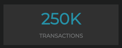
"transactions": "250K",
"weather": "☀️",
"responsiveness": "99%",
"events": "28,320",
"hits": "9.12K",
"convertion": "69%",
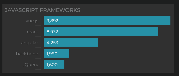
"jsFrameworks": {
"range": [0, 10000],
"values": [9892, 8932, 4253, 1990, 1600],
"labels": ["vue.js", "react", "angular", "backbone", "jQuery"]
},
"topWines": {
"range": [0, 440000],
"values": [440000, 280953, 144500, 120040],
"labels": ["Haut Médoc", "Pessac", "Beaujolais", "Rioja"]
}
}
}To load the API data, we create a XHR client class using the dependency axios that we installed earlier
import axios from "axios";
export default class DashboardAPI {
  static loadDashboardData() {
    return axios.get("./assets/dashboard-data.json");
  }
}
Next we need to setup VueX. If you’re not familiar with it, below are some useful resources on the FLUX architecture:
A lot of the code may look like a lot of verbose at first and may look like over-engineering when one is not familiar with these concepts. But bear with me, this will allow us to scale and mantain the app in the long run, breaking down complexity of a project into smaller and more manageable chunks.
In this tutorial we create a vuex store sub-module widgets which will manage the state/data of our widgets - in this case we have 6 metrics, 2 bar-chart, 1 map-3d vue components.
state.js
Our main state defines the widgets states as well as a boolean flag used to define its loading/ready states. Note that all these values are initialized to null.
export default {
  loading: true,
  widgets: {
    transactions: {
      value: null,
    },
    weather: {
      value: null,
    },
    responsiveness: {
      value: null,
    },
    events: {
      value: null,
    },
    hits: {
      value: null,
    },
    convertion: {
      value: null,
    },
    jsFrameworks: {
      range: null,
      values: null,
      labels: null,
    },
    topWines: {
      range: null,
      values: null,
      labels: null,
    },
    map3D: {
      // not needed in this tutorial
    },
  },
};
actions.js
We only need one action here, which is pulling the data from the API. The action will be dispatched by the Grid when mounted. When called,
- (1) the loading flag is set to true,
- (2) we make a request to the server,
- (3) when complete we mutate the state with the fresh data
- (4) and set the loading flag to false so that the component can now render the available data.
import * as types from "./mutations-types";
import DashboardAPI from "@/api/DashboardAPI";
export const loadDashboardData = ({ commit }) => {
  commit(types.SET_LOADING_STATE, true);
  DashboardAPI.loadDashboardData().then((response) => {
    const { data } = response;
    commit(types.SET_DASHBOARD_DATA, data);
    commit(types.SET_LOADING_STATE, false);
  });
};
mutations.js
The action above commits two types of mutations. These are pure functions that are never async.
import * as types from "./mutations-types";
export default {
  [types.SET_LOADING_STATE](state, value) {
    state.loading = value;
  },
  [types.SET_DASHBOARD_DATA](state, { widgets }) {
    // Metrics
    state.widgets.transactions.value = widgets.transactions;
    state.widgets.weather.value = widgets.weather;
    state.widgets.responsiveness.value = widgets.responsiveness;
    state.widgets.events.value = widgets.events;
    state.widgets.hits.value = widgets.hits;
    state.widgets.convertion.value = widgets.convertion;
    // SVG Charts
    state.widgets.jsFrameworks.range = widgets.jsFrameworks.range;
    state.widgets.jsFrameworks.values = widgets.jsFrameworks.values;
    state.widgets.jsFrameworks.labels = widgets.jsFrameworks.labels;
    state.widgets.topWines.range = widgets.topWines.range;
    state.widgets.topWines.values = widgets.topWines.values;
    state.widgets.topWines.labels = widgets.topWines.labels;
  },
};
getters.js
To read and react from state changes, components rely on vuex MapGetters. We could technically simply declare a widgets getter and use dot notation to retrieve all the widgets data within the tree, but with maintainability and portability in mind we split the getters into a detailed list of widgets:
export default {
  isLoading: (state) => state.loading,
  transactions: (state) => state.widgets.transactions,
  convertion: (state) => state.widgets.convertion,
  hits: (state) => state.widgets.hits,
  events: (state) => state.widgets.events,
  responsiveness: (state) => state.widgets.responsiveness,
  weather: (state) => state.widgets.weather,
  jsFrameworks: (state) => state.widgets.jsFrameworks,
  topWines: (state) => state.widgets.topWines,
};
Load the data!
Now our vuex store is setup, all that’s left is to trigger the main action from a component. In our example, we load the data everytime the Grid component is mounted:
mounted () {
// load fresh data every time we land on the view
this.$store.dispatch('widgets/loadDashboardData')
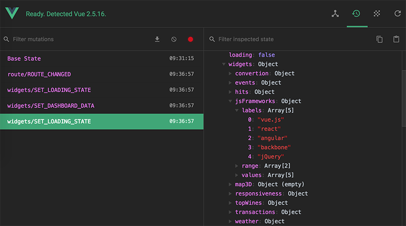
}After the page reloads, open the vue dev tools and you will be able to inspect the global state at any mutation point. This means you can technically travel in time, rolling back to any point of your application state. Fancy isn’t it?
HTML - metric chart
Let’s start with a simple text component that display data using HTML (source file).
This very basic component only takes two attributes which are title and value.
Also, the responsive behavior is inherited from the responsive grid and therefore very flexible with no extra setup work.
props: {
  value: {
    type: [String, Number],
    required: true
  },
  label: {
    type: String,
    default: ""
  }
}
Usage in your tempate:
<metric value="value" label="label" />
SVGs - bar chart
One of the main reasons I really enjoy working with SVG is for its viewBox and preserveAspectRatio property. It allows one to define the size of the viewport and how it should resize. Here is a very good guide on the topic.
<svg
  xmlns="http://www.w3.org/2000/svg"
  preserveAspectRatio="none"
  viewBox="0 0 300 100"
></svg>
Since our viewBox is now defined (300x100), we can safely base our ratio calculations using the fixed unit and let SVG resize the thing for us.
For example:
labelLineOffsetY (index) {
  // chart is 100 unit height
  // we divide 100 by the number of items and multiply by index to get offset
  const offset = Math.round(100 / this.values.length)
  return offset * index
}
Go ahead and resize your browser, you will see that the chart remains consistent, no matter what its scale is.
One way one could extend this tutorial would be to make the SVG font size dynamic and react to the svg size, but that’s out of scope for now.
Canvas - three.js radar
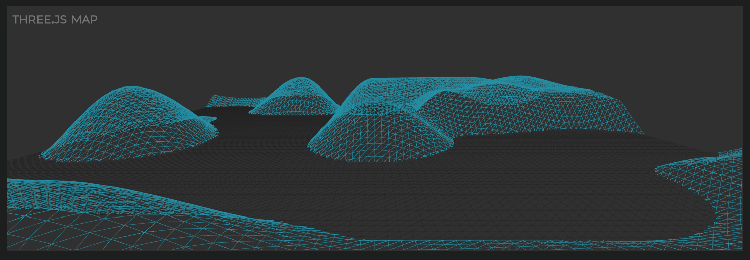
So far we have a small collection of components (html metric and svg chart) and thing haven’t been too complex because most of handling responsiveness was taken care natively by the browser.
When dealing with the canvas element, and especially with the 3D context, we need to manually initialize, destroy and resize our component in order to support various screen sizes and browser resize.
In this example (source file) we will be loading a three.js demo, without focusing on the webgl stuff too much, we will cover the key points to integrate it to your vue app.
First we install three.js - which needs no introduction 😍
npm i three
All the three demo code is included in the src/gl directory.
The GL.js class has 3 methods that we will use from the vue component:
- constructor,
- handleResize,
- destroy
In our canvas component WidgetMap3D.vue
constructor()
Initialize a new canvas when the component gets mounted:
mounted () {
  this.gl = new GL(this.$refs.canvas, this.$refs.container)
}
destroy()
Destory the canvas right before the component gets destroyed:
beforeDestroy () {
  this.gl.destroy()
}
handleResize()
Now if you dig into the sample project, you will notice I added a global window.resize event handler that updates the vuex state:
state.ui.window.width and state.ui.window.height
Our component just needs to import the windowWidth getter and setup a watcher to update the canvas when the window size changes:
Import the vuex MapGetter for the window width:
computed: {
  ...mapGetters({
    'windowWidth': 'ui/windowWidth'
  })
}
Setup watcher and update the canvas on resize:
watch: {
  windowWidth () {
    this.gl.handleResize()
  }
}
Now you can use the component by simply:
<map-3d title="three.js map" />
Put it All Together
Now our grid can import these components and map their attributes with the vuex store data.
Another task of Grid.vue is to tell vuex when to load the data (on component mount). This is done by dispatching widgets/loadDashboardData
Grid.vue (source file)
import WidgetMetric from "@/components/grid/WidgetMetric";
import WidgetChartSVG from "@/components/grid/WidgetChartSVG";
import WidgetMap3D from "@/components/grid/WidgetMap3D";
import { mapGetters } from "vuex";

export default {
  name: "Grid",
  components: {
    metric: WidgetMetric,
    "chart-svg": WidgetChartSVG,
    "map-3d": WidgetMap3D,
  },
  computed: {
    ...mapGetters({
      isLoading: "widgets/isLoading",
      transactions: "widgets/transactions",
      convertion: "widgets/convertion",
      hits: "widgets/hits",
      events: "widgets/events",
      responsiveness: "widgets/responsiveness",
      weather: "widgets/weather",
      jsFrameworks: "widgets/jsFrameworks",
      topWines: "widgets/topWines",
    }),
  },
  mounted() {
    // load fresh data every time we land on the view
    this.$store.dispatch("widgets/loadDashboardData");
  },
};
And finally the template where we bind the vuex data to component attributes, define the CSS classes for the responsive layout, and setup a quick/cheap loading screen.
<template>
  <div class="grid">
    <div v-if="isLoading" class="loading">Loading...</div>

    <metric
      v-if="!isLoading"
      class="widget phone-3-col tablet-2-col desktop-1-col"
      :value="transactions.value"
      label="transactions"
    />

    <metric
      v-if="!isLoading"
      class="widget phone-3-col tablet-2-col desktop-1-col"
      :value="weather.value"
      label="weather"
    />

    <metric
      v-if="!isLoading"
      class="widget phone-3-col tablet-2-col desktop-1-col"
      :value="responsiveness.value"
      label="responsiveness"
    />

    <metric
      v-if="!isLoading"
      class="widget phone-3-col tablet-2-col desktop-1-col"
      :value="events.value"
      label="events"
    />

    <metric
      v-if="!isLoading"
      class="widget phone-3-col tablet-2-col desktop-1-col"
      :value="hits.value"
      label="hits"
    />

    <metric
      v-if="!isLoading"
      class="widget phone-3-col tablet-2-col desktop-1-col"
      :value="convertion.value"
      label="convertion"
    />

    <chart-svg
      v-if="!isLoading"
      class="widget phone-6-col tablet-3-col desktop-3-col"
      title="javascript frameworks"
      :range="jsFrameworks.range"
      :values="jsFrameworks.values"
      :labels="jsFrameworks.labels"
    />

    <chart-svg
      v-if="!isLoading"
      class="widget phone-6-col tablet-3-col desktop-3-col"
      title="top wines"
      :range="topWines.range"
      :values="topWines.values"
      :labels="topWines.labels"
    />

    <map-3d
      v-if="!isLoading"
      class="widget phone-6-col tablet-6-col desktop-6-col"
      title="three.js map"
    />
  </div>
</template>
Building for Production
When you’re ready to share your dashboard with the rest of the world, you will want to build your assets in order to deploy them to a CDN.
vue-cli comes already setup and one can build the assets for production by simpy running:
npm run build
Now sometimes you’ll want to set up specific configs, all you need to do is to create a file vue.config.js at the root of your project. Below is for example a way to set the base url of your project, or the port number of the dev server:
module.exports = {
  baseUrl:
    process.env.NODE_ENV === "production"
      ? "https://www.michael-iriarte.com/article-assets/responsive-vue-dashboard"
      : "/",
  devServer: {
    port: 47000,
  },
};
This is pretty much it for now, a basic wireframe app to add on your own components and visualizations.
Checkout the demo or source on github
I hope this article will help some of you getting started with Vue. Please post in the comments if you have any questions.
Share the web!
Checkout the full source here